

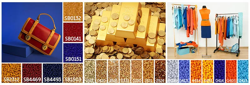
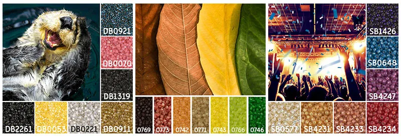
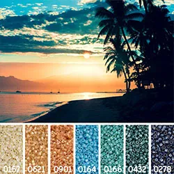
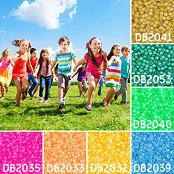
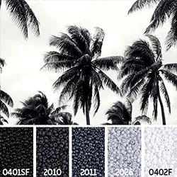
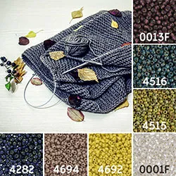
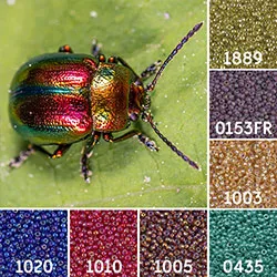
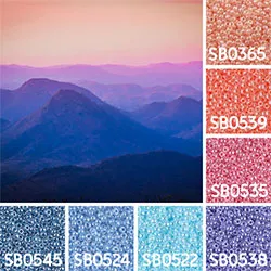
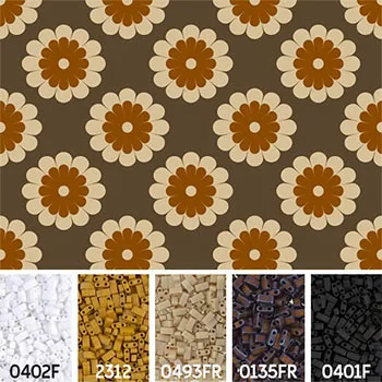
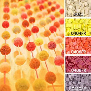
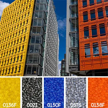
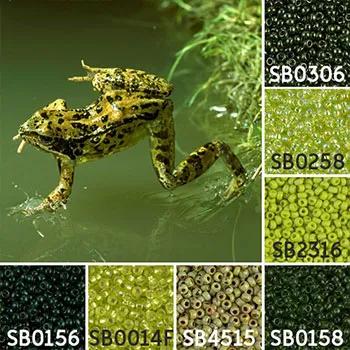
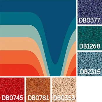
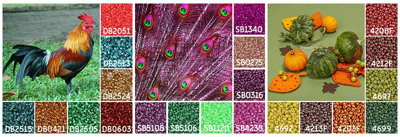
You may have noticed our latest Mayuki Colour Inspiration pictures on social media recently (and also our previous collections from our Mayuki months gone by). They’re a selection of aesthetic images we've chosen to help you create bead colour palettes. Every picture we've chosen is because of its depiction of basic colour theory techniques discussed in the first blog of this series, including primary, secondary and tertiary colours, complimentary and split complimentary schemes and analogous palettes. We've hand-picked each bead colour and where possible tried to match the colours as close as possible to the beads to ensure every collection works.
Of course, you don’t just have to go with our choices; in fact, using your own pictures as inspiration is great because:
1. You've automatically chosen something that appeals to you visually and will reflect your style and taste
2. They can help you choose something that is outside your normal boundaries of colour choice
3. You can enhance your colour theory knowledge to help you understand how colours interact and work better together
4. They can help widen your skills in choosing unique and harmonious colours for future projects
5. You can create a whole suite of beadwork in the same style or theme that you know will all work together
Pictures and colours can evoke different feelings and emotions. If you find yourself drawn to the same type of pictures, you may find they’re all related in how they make you feel. Try to understand what it is that makes it so appealing and how you can translate that into your beadwork:
| Is it because it gives you a sense of balance and calm? |
| Or you like how the colours fill you with energy and motivation? |
| Maybe it’s a timeless combination that exudes sophistication and elegance? |
Whatever your reasons, keep them at the back of your mind when it comes to identifying your bead colours and keep asking yourself if your choices represent what you want them to.
There are many different options for finding a suitable image. If you have an idea of the theme you want to encapsulate, you can:
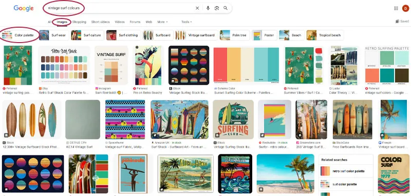
1. Search for some inspiration using Google (make sure you select the 'Images' option to see them as a visual). Try adding the words 'colours' or 'colour palette' to your search. Our 'vintage surf colours' example here also shows how Google has given us the option of choosing colour palette visuals too:
2. Use what's around you as inspiration such as magazines, screen savers on your phone/PC/tablet, patterns and colours on your favourite clothes
3. If you're pretty tech savvy, you can upload images into online colour palette generators or websites such as Canva. These online resources are usually free to use and can easily and quickly generate a palette using the main colours from your images (please ensure you're not infringing on any copyrights or ownership regulations).
N.B. See the end of our blog for links to some useful resources.
Once you’ve chosen your image, it’s time to start pulling out those colours!
Take your time and study your picture to detect the main colours. Look at the colour proportions and how it’s distributed throughout:
|
|
|
| How much of the picture is taken up with one colour? | Is this one colour as a block or is it scattered throughout the scene? | Do you want your design to replicate the placement of the colours e.g. light colours at the top, dark colour at the bottom |
In interior design there’s the 60-20-10 rule that can also be used here. The rule states that 60% of your palette should be your dominant colour (the main body of your beadwork), 30% should be the secondary colour (that adds depth and interest) and the remaining 10% is the accent colour (that gives lift and vibrancy to the design).
| In this picture, the three colours used are Dominant 60% - Taupe-Grey Secondary 30% - Dark Cream Tertiary 10% - Matte Mustard We also topped and tailed the colours with a classic black and white as optional colour extensions. |
| We’d suggest aiming for 3-5 colours as your main palette, though of course you can have more – it's all about keeping it balanced. Many of the images we created use up to 7 colours but that doesn’t mean you have to incorporate them all! Use your picture as a guide as to how much you should use a particular bead colour - this should help you keep your palette cohesive and harmonious. |
| Be careful of multiple strong, bold colours taking over your project. If you prefer to play it safe, aim for neutral colours for the foundation part of your project, with flashes of contrasting colour for highlights. |
If you’re struggling to determine the dominant colours, try either squinting at the picture, or holding it farther away. That way your eyes can stop looking at the details and start to identify the main blocks of colour that stand out. Sometimes looking at the picture through a lens such as a smart phone or tablet camera can also help you to better focus on the colours as opposed to the content. The added advantage is that you can also play around with the colour settings on the camera whilst doing this, to better help you recognise when colour values are too similar (we mentioned this in our previous blog black and white too)
| Look at the visual effects in your image and think about how they can be replicated in beads e.g. dapples of light could be denoted by silver-lined or metallic finishes, heavy, dark or blocks of colour could be represented by opaque or matte finishes. |
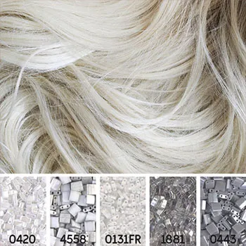
Some images we’ve used are all based on one colour with subtle variations. These images can help you to explore different tones and shades in that colour, whilst keeping to a cohesive colour palette.
| If your image is analogous, try mixing and matching different finishes in your colour to create contrast and definition. |
Be open to adapting your bead palette slightly. There are only so many different bead colours available and some bead colours can ‘shift’ their appearance when next to other beads. Therefore, you may need to select some colours that are lighter or darker than they originally appear in the image, to better depict your concept. Allow yourself time to test and adjust your choices to get them right in the long run, otherwise your beadwork may fall short of your expectations.
| In this example the bead colours don't quite exactly match the image, however the overall 'retro' colour theme is represented closely enough for them to work together. |
Next time you’re unsure of a bead colour palette, find something to get you started on your colour journey. Actively look for lots of different types of visual inspiration as they can help spark new ideas, unlock your creativity and encourage you to move beyond your normal colour choices.
Here’s some useful links for some online help creating colour palettes:
Canva Colour Palette Generator
Want a colour scheme that perfectly matches your favourite images? With Canva’s colour palette generator, you can create colour combinations in seconds. Simply upload a photo, and they’ll use the hues in the photo to create your palette.
The superfast colour palette generator; create the perfect palette or get inspired by thousands of beautiful colour schemes.
Over 6 million free high-resolution photos and illustrations brought to you by the world’s most generous community of contributors.
Free stock photos, royalty free images & videos shared by creators.
We came across this website from Sarah Renae Clark, a colouring book artist and designer who creates the most beautiful work. She has created a whole blog series on different colour palette collections (such as sunsets, ocean life and animals) which she very kindly shares with everyone as a free resource.